Video caption design for readable three scene stories
Make your scene text readable without sound. Compare a crowded coffee caption with a tighter version, review contrast during movement, protect the important part of your photograph, and balance wording against shared scene timing. Check the exported file and save the approved copy for your next edit.
Start video caption design with the viewing conditions
Video caption design starts with where the words will be read. A line that looks comfortable on a desktop preview may feel crowded on a phone. Decide which frame you will use, how long each scene will last, and which part of the photograph needs to remain visible. Make these decisions before polishing individual words.
In this studio, captions are visible scene text. They communicate the story in a silent video, rather than transcribing a recorded speaker. Make each line understandable on its own while connecting it to the lines before and after it. Viewers should understand the message without a soundtrack.
Reduce reading effort before adding emphasis
Write the shortest line that carries the intended meaning, then check whether any removed word was actually necessary. Keep the subject concrete. "Set one task for the morning" gives the viewer an action; "Unlock the potential of your day" leaves them to interpret an abstract promise. Short wording leaves room for the photograph.
For video caption design, the studio's 120 character limit is a technical maximum. It does not establish how much a viewer can comfortably read. Avoid packing each scene to that limit. If a sentence has several clauses, keep the part essential to this scene and move the rest into accompanying page copy. Readable video captions usually require an editing decision before a visual adjustment.
Check caption contrast across the moving image
Inspect the text while the preview plays. A caption can be clear against a dark part of a photograph and harder to read when a bright object moves behind it. Watch the first, middle, and last visible moments of each scene. Shelves, leaves, and printed labels can compete with the letters even when colors differ.
Caption contrast is a video caption design check that needs the complete sequence. The studio provides accent choices within its caption styling, so compare them against your selected source. If none gives a comfortable result, choose a quieter image or revise the framing choice. Avoid placing your whole message in a decorative treatment that only looks readable when playback is paused.
Let the subject keep enough space
Choose portrait or square by looking at the photograph and intended placement together. Portrait provides a tall frame; square changes which edges remain visible. A caption that covers a face, a product label, or the feature being discussed weakens the connection between words and image. The canvas comparison guide helps evaluate these tradeoffs before export.
Good video caption design accounts for the fixed layout available in the editor. When the composition conflicts with the text, replace the source, select a different canvas, or shorten the line. The image animation guide covers source preparation. Do not rely on an important object at the photograph's edge remaining visible throughout every movement of the frame.
Compare two versions of a coffee caption
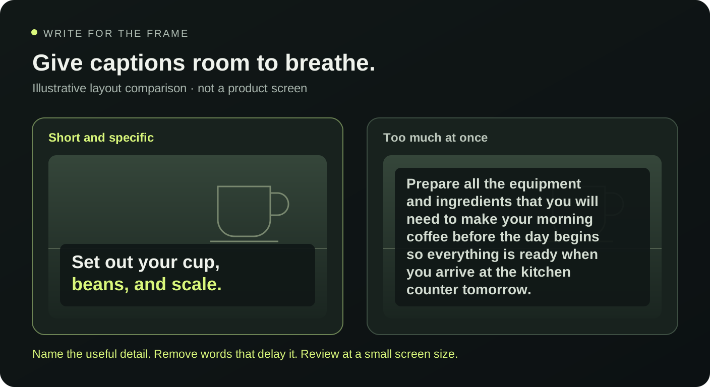
Imagine a photograph of an espresso cup on a table beside an open notebook. A crowded middle line reads, "Take a little time to enjoy your coffee and consider everything you hope to achieve today." A tighter version reads, "Coffee first. Choose one task." The second makes the action clearer.
This video caption design example fits a fifteen second sequence with five seconds per scene. An opening such as "A quiet start before the first task" establishes the moment; the revised middle narrows attention; "Begin with the next small step" closes it. Try the daily ritual format and replace these lines with wording that matches your own photograph and purpose.
Match caption length to the shared scene duration
The duration setting applies equally to all three scenes, from three to eight seconds per scene. Longer timing increases the whole sequence. Start by previewing the draft at the intended pace and reading the words once, without rehearsing them first. If the middle is difficult to finish, cut that sentence before extending two other scenes that already read comfortably.
Review video caption design with a second reader when possible. Ask what the opening promised and what the ending meant, rather than asking whether the video looks nice. If they interpret a line differently, edit the wording. The short video hook guide helps make the first caption specific without turning it into a promise that the remaining scenes cannot answer.
Inspect the exported text and keep the approved copy
Open the browser studio with one local JPG, PNG, or WebP image no larger than 10 MB. Choose a template and finish the captions before exporting. The output is silent WebM recorded in real time; keep the tab active until the download completes. Watch that file at a realistic display size.
The final video caption design check concerns the words as delivered. Confirm spelling, punctuation, contrast, and whether the last line stays readable. Save the TXT script or JSON brief with the downloaded Hypit video and your original source image. Those planning downloads do not contain the photograph. Keep revision names clear so a later edit does not accidentally restore an older caption.
Are these captions the same as subtitles?
These captions are scene text that presents the message of a silent sequence. The browser workflow does not transcribe speech or add audio. If a later edit includes spoken narration, review its subtitle requirements separately in the tool used for that production. Do not assume the three existing scene lines reproduce everything a speaker might say.
What should I change when a line feels crowded?
Start video caption design revisions by removing repeated setup words and secondary ideas. Keep the object or action the viewer needs now. Preview the shorter version against the photograph, then compare canvas shapes if the layout still conflicts. Increasing duration can help pacing, but it will not resolve text covering a key product detail or a busy background.
How do I know the captions are ready?
Complete video caption design when each scene is understandable, the sequence has a clear connection, and the exported text reads comfortably at the intended size. Check the actual download and preserve the approved wording. Use the export review checklist for the remaining delivery checks before you share the file or send it for further editing.